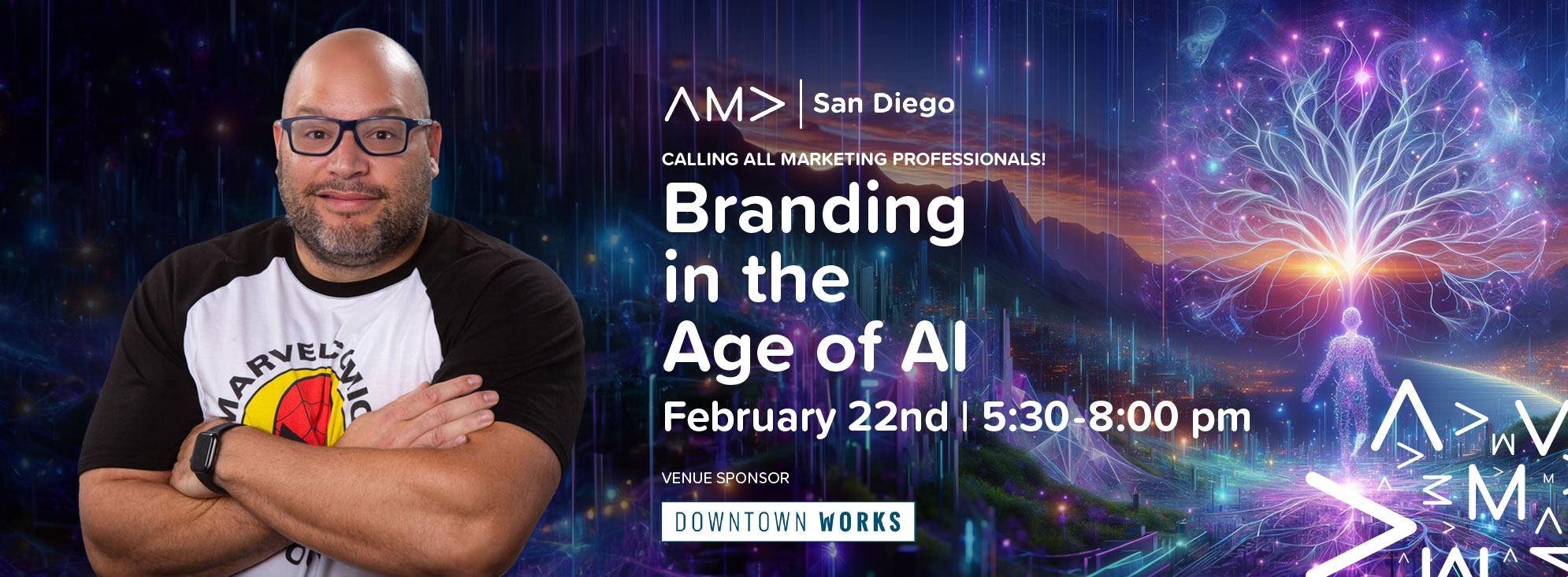
 Are you ready to embark on a wild ride through the quirky world of branding, artificial intelligence (AI), and creativity? Buckle up because we're about to take you on a rollercoaster journey at the upcoming event, "Branding in the Age of AI." We'll be virtually gathering to unravel the mysteries of how AI is reshaping the branding landscape. From predictive analytics to personalized experiences, AI is like the fairy godmother of branding, granting wishes and making dreams come true (well, almost). But before we dive into the serious stuff, let's take a moment to appreciate the unexpected wisdom of Jack Reacher. Yes, you heard that right. The man with the plan, the legend himself. In our recent blog post on [Your Company's Blog Name], titled "What Graphic Designers Can Learn from Jack Reacher," we uncovered some surprising parallels between Reacher's no-nonsense approach and the principles of effective graphic design. Who knew a fictional tough guy could teach us so much about branding? Now, let's sprinkle in a bit of humor as we extend our analogy to the realm of branding and AI. Picture this: Jack Reacher strutting through a crowded marketplace, armed with nothing but his wits and a smartphone loaded with AI-powered branding tools. As he navigates through the chaos, he's making split-second decisions, just like brands do when leveraging AI to stay ahead of the competition.
But wait, there's more! The fun doesn't stop there. In another blog post on [Your Company's Blog Name], titled "AI Art: The Intersection of Creativity and Technology," we explored how AI is reshaping the landscape of artistic expression. It's like having a robot Picasso painting masterpieces while you sip your morning coffee. Who knew robots had such a knack for art? And let's not forget about Adobe Photoshop Beta, the superhero of design software. In our blog post titled "Harnessing the Power of AI in Adobe Photoshop Beta: A Marvel for Design Heroes," we uncovered how AI-driven features can turn even the most amateur designer into a design superhero. Move over, Iron Man. There's a new hero in town, and it's AI-powered Photoshop. As we prepare to dive headfirst into these topics at the "Branding in the Age of AI" event, we invite you to join us for a wild ride filled with laughter, insights, and maybe even a few surprises along the way. Don't miss out on the chance to learn, laugh, and connect with industry leaders who are shaping the future of branding in the digital age. So grab your virtual ticket, put on your best poker face (or your best Jack Reacher scowl), and get ready for an adventure like no other. We'll see you there! 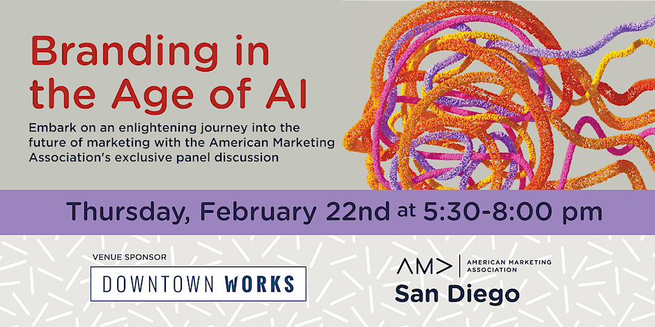
0 Comments
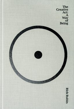
A Journey Through Rick Rubin’s 'The Creative Act' 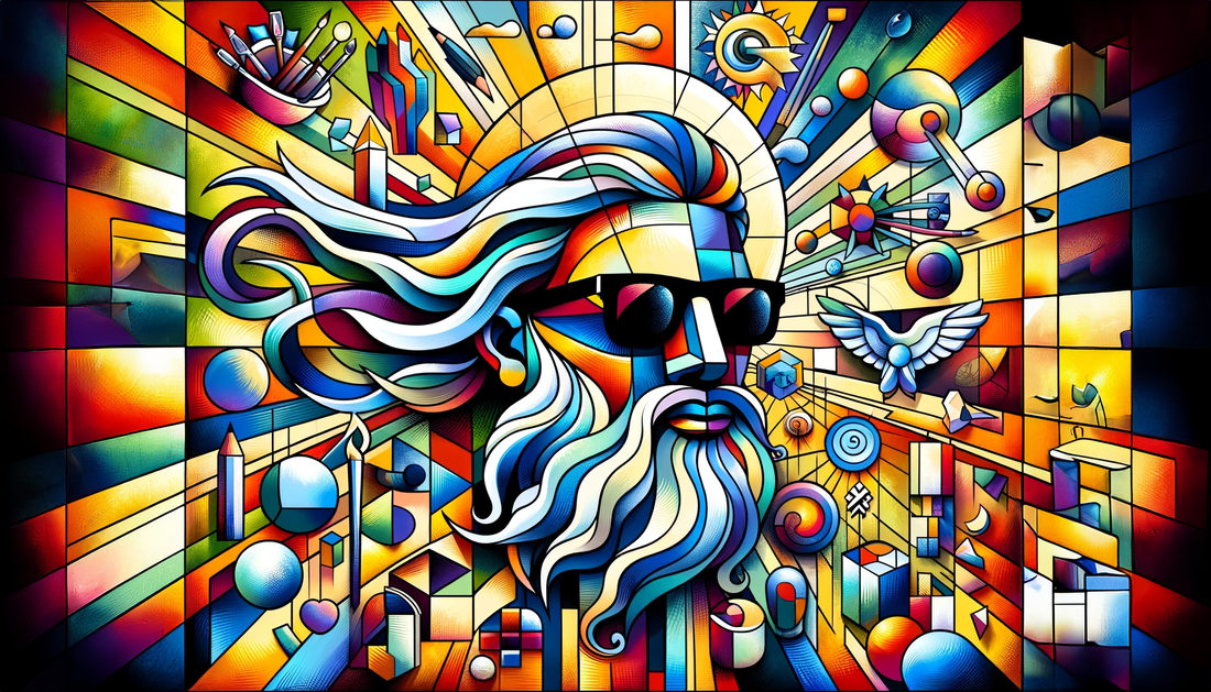 Dive into the world of creativity with our in-depth exploration of Rick Rubin's "The Creative Act: A Way of Being." This book, filled with 78 insightful musings, offers a unique perspective on creativity, artistic expression, and the essence of being an artist. Perfect for creators, artists, and anyone seeking to unlock their creative potential.
The Essence of Creativity: Rubin challenges the myth that creativity is a rare gift, proposing instead that it is an innate human quality. He invites readers to adopt an artist's perspective in their daily lives, emphasizing deep observation and engagement with the world. This transformative view encourages finding artistic inspiration in everyday experiences, making creativity a part of one's fundamental way of interacting with the world. Exploring the Creative Process: Rubin takes readers on a deep dive into the creative process, illustrating that every idea has its moment and that the act of creation is about more than commercial success. He draws parallels between the complexity of nature and the human inner world, encouraging artists to draw inspiration from their rich internal landscapes. Guiding Principles for Artists: Rubin offers invaluable guidance for artists, emphasizing the importance of following one's intuition over external advice. He discusses strategies for overcoming creative blocks and stresses the importance of free play in creativity, suggesting that embracing one's flaws and insecurities can lead to more authentic and resonant work. Phases of Creative Work: Rubin breaks down the creative journey into four distinct phases: collecting ideas, experimenting, refining, and completing. He provides insights into navigating each stage, focusing on the value of internal success and authenticity over external recognition and acclaim. Concluding with the transformative impact of "The Creative Act: A Way of Being," Rubin's book emerges as an essential guide for anyone seeking to understand and nurture their creative potential. It's a manifesto for authenticity, intuition, and personal growth in the artistic journey
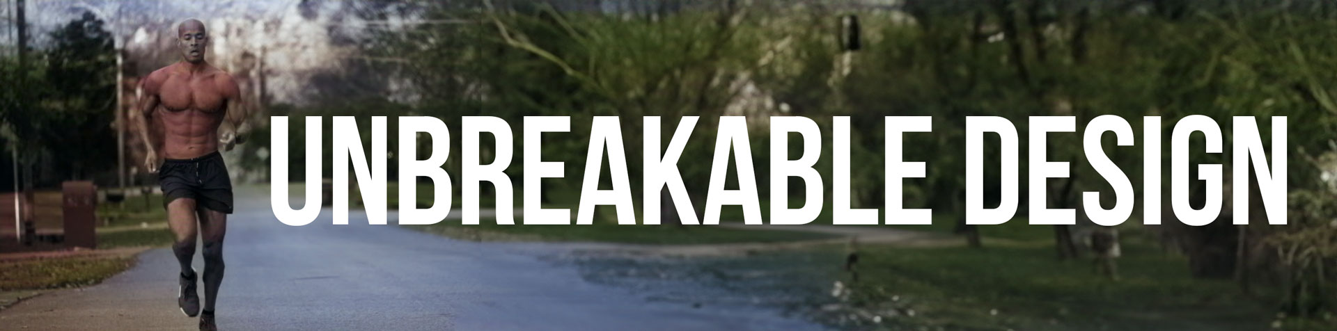 Drawing Inspiration from David Goggins' 'Can't Hurt Me' for Creative Resilience David Goggins, a renowned ultramarathon runner, triathlete, and retired Navy SEAL, has become a symbol of resilience, mental toughness, and unyielding determination. His autobiography, "Can't Hurt Me," is more than just an inspiring tale of physical endurance; it's a roadmap for anyone looking to push past their limits and conquer their dreams. For designers and creative professionals, Goggins' philosophy and experiences can be a transformative guide. His principles, ranging from embracing challenges to nurturing a relentless commitment to excellence, resonate deeply within the design world, offering valuable insights for personal and professional growth. In this piece, we'll explore how Goggins' writings and life lessons can empower designers to tackle their challenges with courage and innovation.
"Can't Hurt Me" by David Goggins is more than just a memoir; it's a manual for mental resilience and toughness that has surprising resonance within the design profession. In the book, Goggins shares his life journey, one filled with hardship, struggle, and ultimately triumph. His principles can be applied directly to the world of design, where the grind is relentless, and attention to detail is key. From the ideation stage to the final rendering, designers must push through obstacles and never settle for mediocrity, much like Goggins' rigorous military training. His theory that most people only tap into 40% of their potential is a challenge for designers to break through self-imposed limits, accessing the untapped 60% to create innovative and impactful designs. Building a resilient mind helps face criticism and failure; in design, rejection and revision are part of the process, and learning to accept and grow from them makes the end product more robust and refined. Holding oneself accountable through setting clear goals and meeting deadlines is paramount in achieving success, and visualizing the successful completion of a design project can be a powerful motivator. Goggins often took the road less traveled to reach his goals, and in design, thinking outside the box and exploring unconventional methods can lead to groundbreaking work. "Can't Hurt Me" provides a robust framework for anyone seeking to elevate their life, and these principles resonate profoundly within the design profession. By adopting Goggins' mindset, designers can build resilience, innovate, and create without fear of failure or rejection. It's a call to action for all creatives to strive for excellence, no matter the hurdles in the path. In embracing the lessons of "Can't Hurt Me," designers find a powerful ally in the quest for creative excellence. The tenacity, resilience, and unbreakable spirit championed by Goggins resonate deeply with the challenges and triumphs inherent in the design process. By applying his philosophy to their craft, designers can transcend ordinary boundaries, face adversity with courage, and transform obstacles into opportunities for growth. David Goggins' story is a testament to what can be achieved with unwavering focus and determination, values that can inspire designers to reach beyond the expected and create works that are not only visually compelling but emotionally resonant. His mindset becomes a tool, a guide, and a constant reminder that in the realm of creativity, just as in life, one's true potential is bound only by the limits they set for themselves.
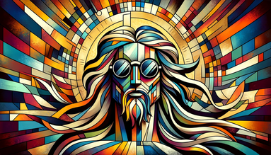
 Introduction to AI Art Are you intrigued by the combination of AI and art? You're not alone. AI art, or artificial intelligence art, is transforming how we create and perceive art. What is AI Art? AI art, also known as algorithmic art, employs machine learning and algorithms to generate visual masterpieces. Here's how it works: The Process of Creating AI Art
The Impact of AI Art Democratizing Creativity With AI art tools, digital art creation is accessible to everyone. A New Artistic Medium For professional artists, AI introduces a fresh, innovative medium. Ethical Considerations The ownership and authenticity of AI-generated art raise exciting debates. My Experience with AI Art: Photoshop's Beta Gen Fill and AI Remini App As someone deeply engaged in the world of design, I've had the unique opportunity to experiment with cutting-edge AI tools. Two tools that have particularly caught my attention are Photoshop's beta gen fill and the AI Remini app. Photoshop's Beta Gen Fill: A Game Changer Photoshop's beta gen fill is an innovative feature that leverages AI to enhance creativity. I've found it to be an incredibly powerful tool that allows for intricate manipulations and refinements in my designs. By enabling a seamless blend of human creativity and AI's computational prowess, it's opened new horizons in my work. AI Remini App: Recreating Memories I've also explored the AI Remini app, a brilliant tool that turns low-resolution images into high-quality photos. By using this app, I've been able to breathe new life into old memories, transforming them into stunning visual experiences. The ease of use and quality of output have been nothing short of astonishing. These tools are more than just technological advancements; they represent a shift in the way we think about and create art. For professionals like me, they offer endless possibilities to innovate and redefine the boundaries of creativity. 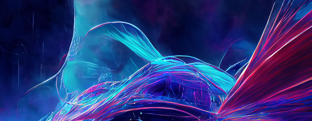 I used this prompted generated by Chat GPT to create this image in Photoshop Beta: Create a dynamic and visually striking representation of the future of AI art. The piece must resonate with the cutting-edge nature of AI's impact on the artistic world, weaving together hyper-realism, abstract technological elements, and vibrant colors. The Future of AI Art - A Symphony of Hyper-Realism, Abstract Technology, and Vibrant Creativity Breakdown:
Final Note: This creation will not only be an artistic piece but a statement on how AI is revolutionizing art. It should inspire artists to explore new territories, embrace cutting-edge tools, and challenge conventional creative paradigms. AI art is reshaping the art world. Its intersection with creativity offers a fascinating look into art's future. Want to join the conversation about artificial intelligence in art? Share your thoughts below.
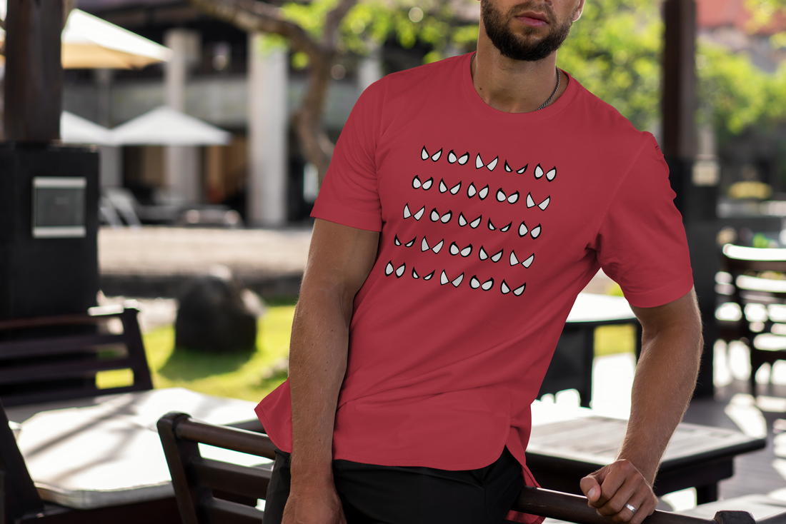
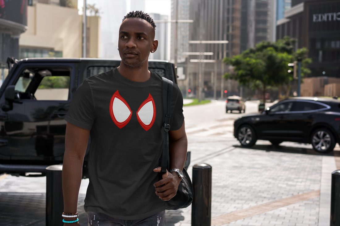
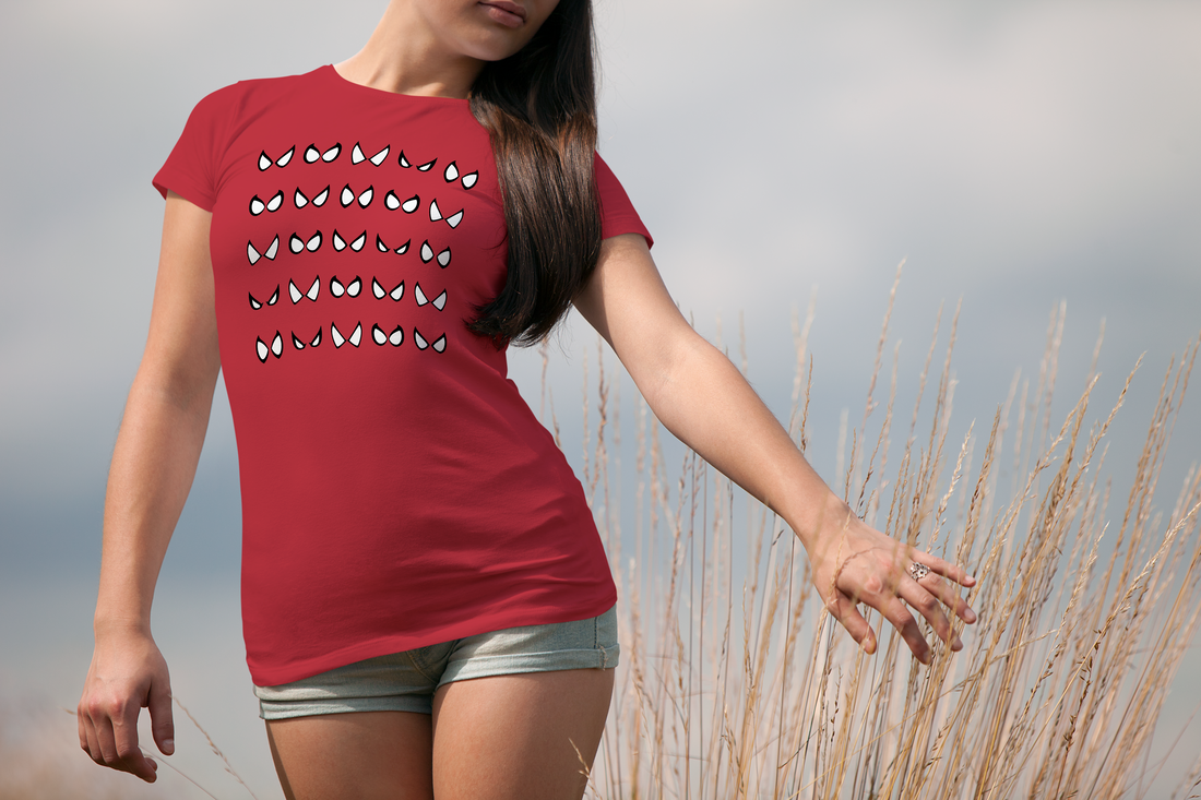
A Web of Marketing and Graphic Design Inspiration How often do you find a superhero movie that makes your jaw drop, not just for the action sequences, but for its graphic design? Not often, right? Well, "Spider-Man: Across the Spider-Verse" has done just that, pushing the boundaries of animation and providing a plethora of graphic design inspiration. 1. Dare to be Different: The film flaunts a unique blend of 2D and 3D graphics, comic-like texture overlays, and unconventional color palettes. As graphic designers, we should take a leaf out of the Spider-Verse's book and dare to challenge the status quo. Being different in your designs can make you stand out in an ocean of sameness. 2. Embrace the Power of Color: Spider-Verse is a psychedelic explosion of color that creates mood, shows character personality, and guides the audience's attention. Color is a potent tool in graphic design that can evoke emotions and make a design memorable. 3. The Magic of Text: From the quirky comic-style onomatopoeic words to the poignant quotes, the film uses text creatively to enhance visual storytelling. Text isn’t just for conveying information; it can be a powerful design element when used inventively. 4. Consistency is Key: Despite its diverse array of visuals, Spider-Verse maintains a consistent design language. It's a lesson in maintaining brand consistency across different designs and mediums. 5. Take Risks and Experiment: Spider-Verse is a result of brave experimentation, which paid off tremendously. As graphic designers, we must not shy away from risks. Pushing the boundaries is often the way to create groundbreaking designs. 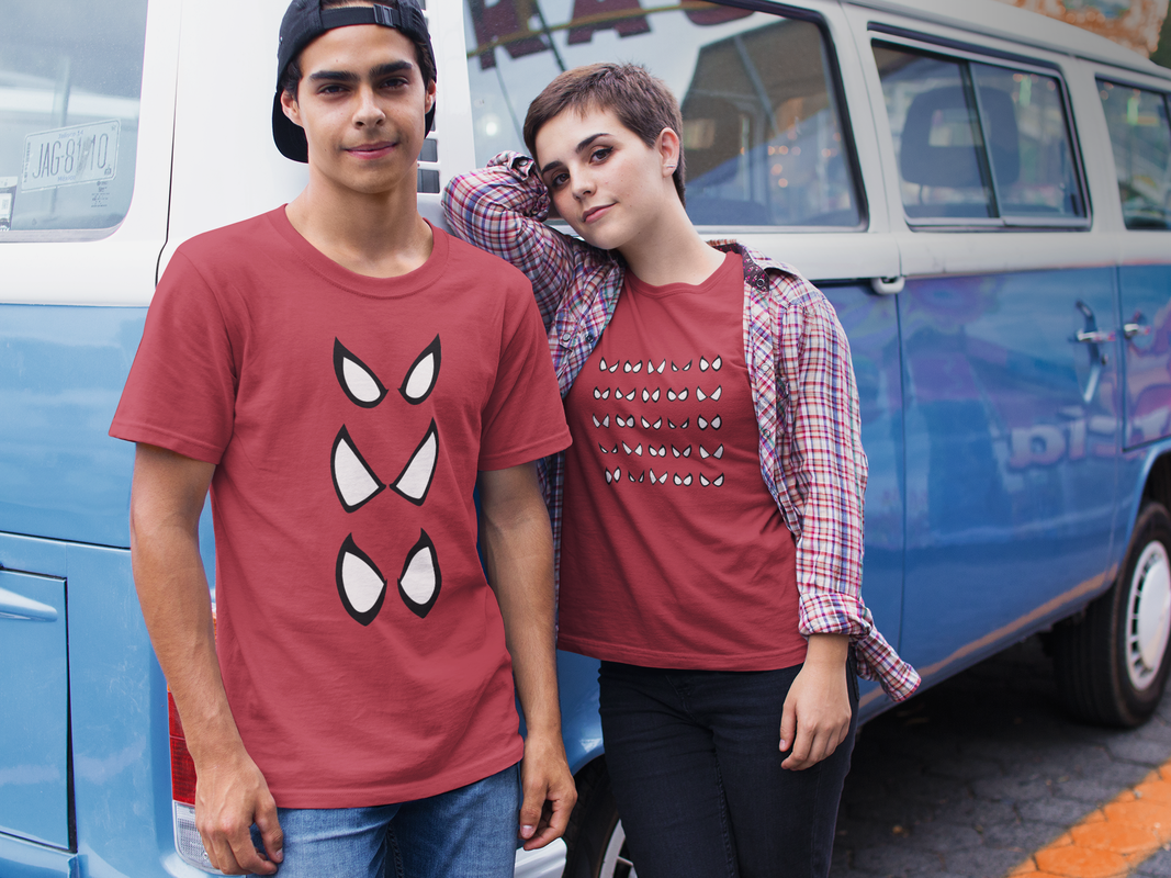 Web-Slinging Through Marketing: Lessons from 'Spider-Man: Across the Spider-Verse In the depths of the bustling multiverse, one movie emerged, teaching us not just the beauty of being unique but also some valuable marketing lessons we never saw coming. Enter the vividly imaginative and universally celebrated "Spider-Man: Across the Spider-Verse." Today, we're unmasking the hidden marketing gems this box-office sensation has to offer. 1. Embrace the Power of Uniqueness: Just as the film showcased a medley of distinctive Spider-heroes, your brand should highlight its unique qualities. Amidst a multitude of competitors, what makes your brand stand out like Spider-Ham in a group of Peter Parkers? Define it, flaunt it, and own it! 2. Storytelling is Key: 'Spider-Verse' left us all mesmerized with its powerful storytelling. Likewise, compelling narratives can significantly boost your marketing efforts. Engage audiences with stories about your brand, your journey, and your victories. 3. Cater to a Diverse Audience: Just as the Spider-Verse is home to a diverse ensemble of characters, your marketing should aim to reach a broad spectrum of audiences. Appreciate the diversity in your audience and tailor your marketing strategy accordingly. 4. Bold Visuals Captivate: 'Spider-Verse' is widely praised for its innovative and vibrant visual style. In your marketing efforts, make sure to incorporate eye-catching visuals. A well-placed infographic or an engaging video could be your ticket to capturing audience attention. 5. Stay Agile and Adapt: In the Spider-Verse, our heroes continually adapt to new challenges. Similarly, marketers need to be flexible and ready to adapt to market changes, customer behaviors, and industry innovations. In conclusion, 'Spider-Man: Across the Spider-Verse' is not just an epic superhero tale but also a treasure trove of marketing wisdom waiting to be unlocked. So, as we swing forward, let's take these lessons to heart and bring our own marketing universes to life, one web at a time.
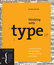
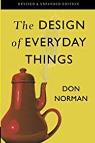
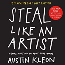
Hello fellow Creative Crusaders! Allow me to lift the cape and shine the Bat Signal on some crucial tomes that have been my trusty sidekicks on this thrilling journey in the design universe. These books have bolstered my design superpowers, serving as my Alfred to my Batman, providing insights, advice, and inspiration in every swoop and swirl of my creative endeavors. First up in our Hall of Justice is "Thinking with Type" by Ellen Lupton. This book is like my Green Lantern’s power ring - a vital tool for harnessing the universe's raw energy - in this case, typography. It’s a deep dive into understanding and appreciating the elemental yet profound role of type in design. Next is "Steal Like an Artist: 10 Things Nobody Told You About Being Creative" by Austin Kleon. This book reminded me of the true power of 'mutation' a la X-Men. It champions the philosophy of adopting, adapting, and evolving ideas into your own unique creative expression. "Logo Design Love: A Guide to Creating Iconic Brand Identities" by David Airey is the Captain America's shield of design books. Airey shares strategies to build iconic brand identities, as resilient and recognizable as Cap’s shield. "How to be a Graphic Designer, Without Losing Your Soul" by Adrian Shaughnessy is like the heartwarming narrative of Spider-Man, reminding us of the mantra, "With great power, comes great responsibility". It guides us on maintaining authenticity in our creative journey. Then we have "The Design of Everyday Things" by Don Norman. This one is the Wonder Woman's Lasso of Truth for designers, illuminating the truth behind intuitive design and user experience. In the lineup, "Make It Bigger" by Paula Scher is the Thor’s Mjolnir, wielding the power of her extensive design experience and wisdom to deliver a thunderbolt of inspiration. "Grid Systems in Graphic Design" by Josef Müller-Brockmann – the Iron Man's suit of the design world, it's all about precision, structure, and technology – the backbone of every solid design layout. And lastly, "Sagmeister: Made You Look" by Stefan Sagmeister. This is like stepping into Doctor Strange's Sanctum Sanctorum, a treasure trove of the mystical and unique, sparking immense creative inspiration. Book Covers and Amazon Links:
Honorable Mention:
As we conclude this thrilling escapade through the maze of inspiration and wisdom, one thing is clear – a Creative Director’s education never truly ends. Much like our cherished superheroes, who continually adapt and evolve, we too, in our design journeys, must keep exploring, learning, and pushing boundaries. We covered typography to branding, creativity to authenticity, user experience to professional wisdom, and structured layouts to unique inspiration. But there’s always more knowledge waiting to be unveiled, more wisdom to absorb.
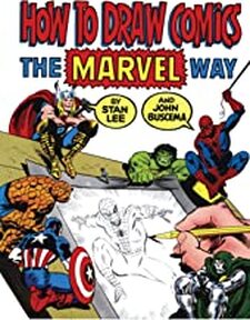
For the sake of honorable mentions and a special nod to our superhero theme, we can't ignore "How to Draw Comics the Marvel Way" by Stan Lee. This classic resource, as timeless as the invincible Wolverine himself, offers valuable insights into the art of creating iconic comic characters. It's the perfect combination of education and entertainment, reminding us that at the heart of our profession lies a simple truth – design is meant to be fun, adventurous, and a little bit extraordinary, much like the superheroes we've been referencing. So, as we hang up our capes and stash away our power rings for the day, let's remember to keep our minds open, our pencils sharp, and our spirits high. Like superheroes saving the world, we have a mission too - to make it more visually appealing and meaningful. And armed with the power of these phenomenal books, there's no challenge we can't conquer. Until the next adventure, fellow creatives! 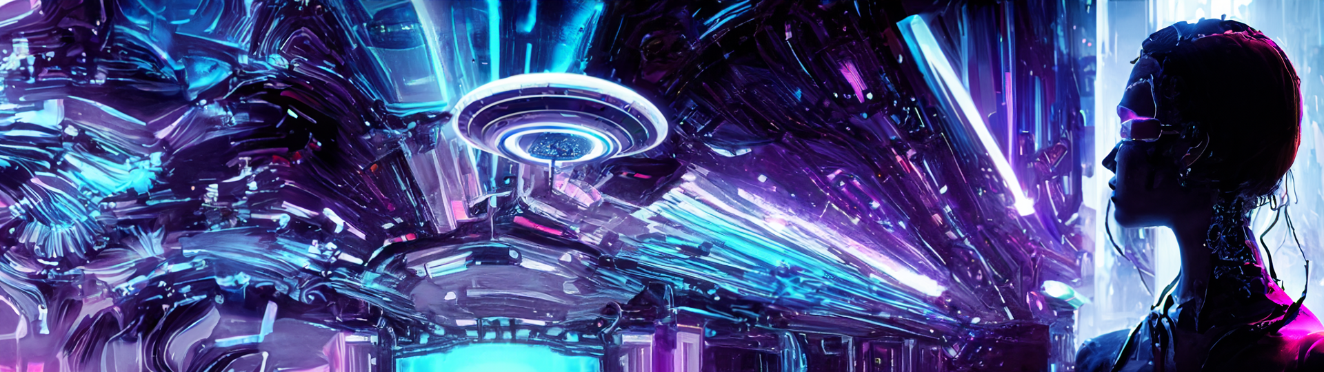 Completely generated in Photoshop without reference photography. Welcome to the new era of digital design, where technology meets creativity in a vibrant clash of innovation and color. Just when you thought Adobe Photoshop had pulled a Superman, leaping tall buildings in a single bound, they've gone and done a Tony Stark, inventing a whole new suit of armor for the design world to gawk at. Ladies and gentlemen, put your capes on for the Adobe Photoshop Beta with AI!
Dubbed by some as the "Infinity Gauntlet" of design tools, this powerful new iteration of Photoshop is about to change the game completely. As if stepping into a world straight from the pages of Marvel comics, we're looking at a program that is no longer merely reactive but predictive, intuitive, and - dare we say - almost sentient! Through the magic of AI, the new Adobe Photoshop Beta not only accelerates your design process but also opens up an entirely new universe of creative possibilities. Imagine a tool that can anticipate your needs, streamline workflows, and dramatically reduce the time spent on mundane tasks. Imagine having a superpower of unlimited design capability right at your fingertips. This incredible breakthrough means that we can now let our creativity soar without constraints, just like our favorite superheroes. Whether you're sketching the next iconic logo, adding the final touches to an intricate illustration, or putting together a stunning visual for a client's marketing campaign, the Adobe Photoshop Beta with AI is your sidekick, ready to leap into action and save the day. So, dust off those capes and prepare to embrace the future of digital design. The new Adobe Photoshop Beta with AI is here, offering a marvel of features that will supercharge your design process. Stand back, fellow design heroes, it's time to unleash your creative powers and take the design world by storm! Top 5 reasons to try the Adobe Photoshop Beta with AI:
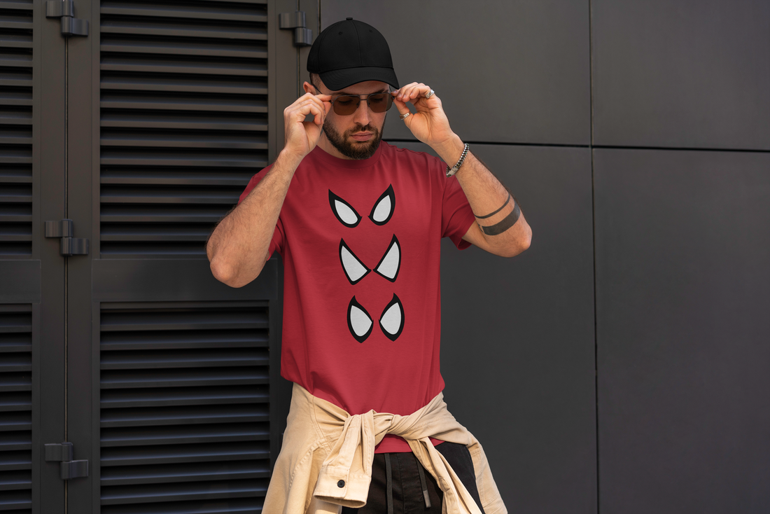
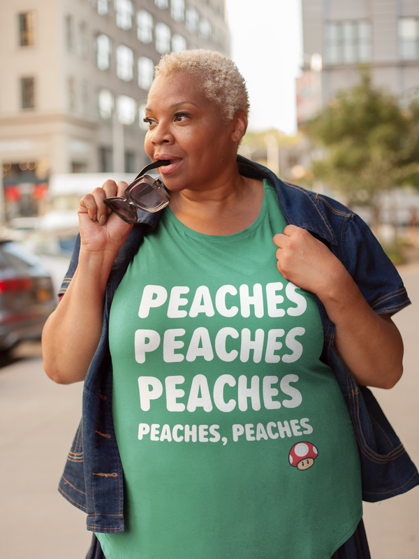
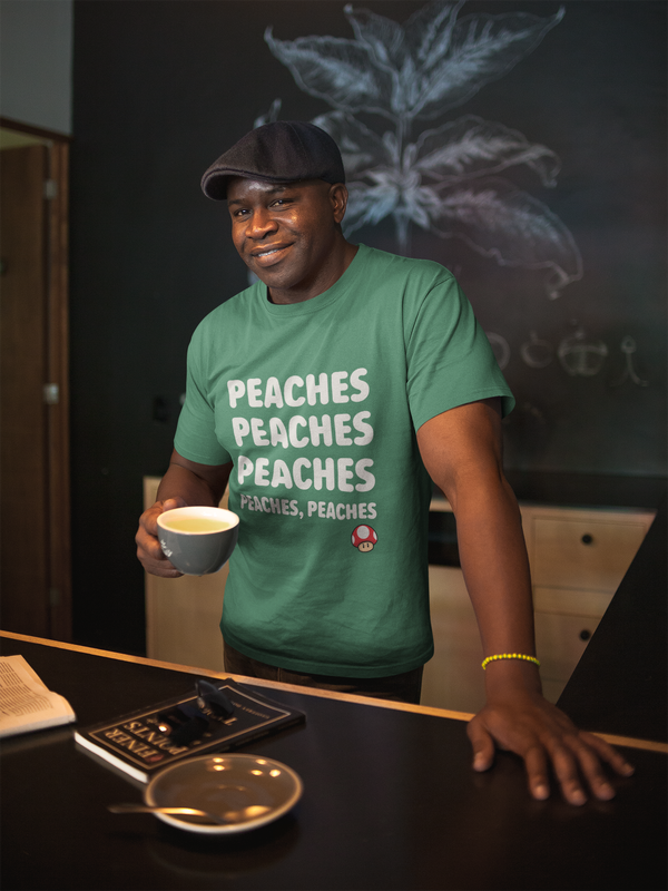
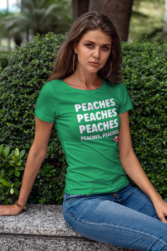
#AdobePhotoshop #AIBeta #DesignHeroesUnite #HarnessingThePowerOfAI #PhotoshopSuperpowers Peach in the Mushroom Kingdom and Beyond Welcome, Nintendo ninjas and Super Mario marvels! Buckle up for a magical warp pipe journey through the world of the iconic Mario Bros., with a special focus on everyone's favorite damsel-not-always-in-distress, Princess Peach. With her golden hair, pink dress, and unyielding courage, Peach has been both a beloved character and a style icon in the gaming universe. She has sparked our imagination and, recently, even inspired our latest t-shirt design! The Birth of a Princess Nintendo's Super Mario Bros. was launched in 1985, and Princess Peach (then known as Princess Toadstool) made her debut. She was the creation of the legendary game designer Shigeru Miyamoto, the mastermind behind some of Nintendo's most iconic characters. Miyamoto's goal was to create a character who, despite being a princess, was far from being a fragile stereotype. Peach was designed to be the beacon of hope for the Mushroom Kingdom, an empowering figure who could stand up to the evil Bowser. Even when kidnapped, she often played an active role in her own rescue. Talk about girl power! Peach in the Spotlight Over the years, Peach's character evolved significantly. She went from being the game's trophy to a playable character in her own right, such as in Super Mario Bros. 2, Super Princess Peach, and many of the spin-off games. Peach's character development embodies a significant shift in the gaming industry's perception of female characters, from damsels in distress to dynamic heroines. Princess Peach and The Mario Bros. Movie Magic Fast forward to 2023, and the world has been treated to a fresh take on the Super Mario Bros. universe with the release of the Mario Bros. movie. One of the most unexpected surprises in the film was the hilarious and catchy "Peaches Song" performed by none other than Jack Black. Now, what do you get when you mix a rocking tune, a comedic genius like Jack Black, and an iconic princess? A viral sensation that had us all humming, "Peaches, Peaches, Peaches, the Princess of the Pitches!" in the shower, at work, and pretty much everywhere else. 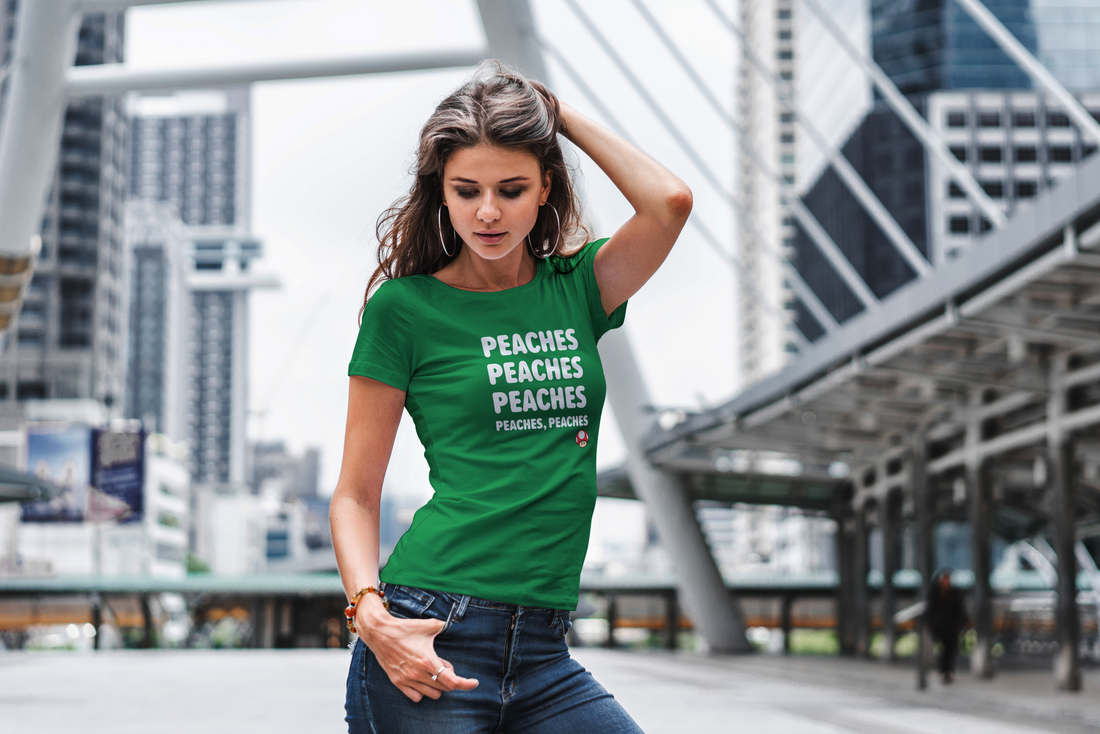 The Peach-Perfect T-Shirt Inspired by the phenomenon that is the "Peaches Song", we’ve decided to bring a piece of this magic to your wardrobe. Our new t-shirt design pays homage to Princess Peach and the Mario Bros. movie in a way that’s both stylish and fun. It features a stylishly cartoonish version of Peach, surrounded by whimsical musical notes, with the catchy "Peaches" lyrics playfully winding around her. And if you're wondering, yes, the design is as catchy as the tune itself! We like to think of it as wearable art that celebrates the fusion of gaming and pop culture. It's also a conversation starter, a perfect piece for any gaming convention or just a casual day out. So, let's take a leap of faith, just like Mario does towards those seemingly impossible platforms. Embrace the magic, the adventure, and the nostalgia that comes with it. Be a part of the Super Mario legacy, one t-shirt at a time. After all, we're all a little bit of Mario, running through our own worlds, overcoming our own challenges, and yes, occasionally rescuing our own princesses.
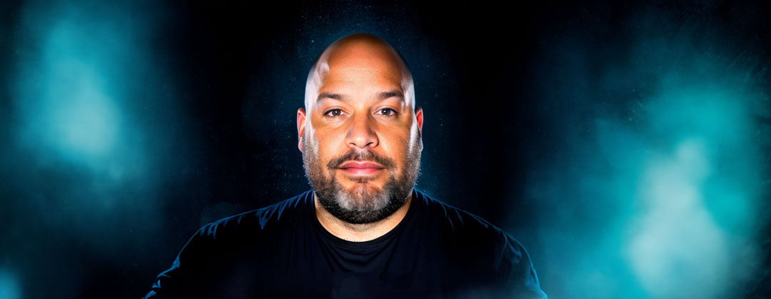
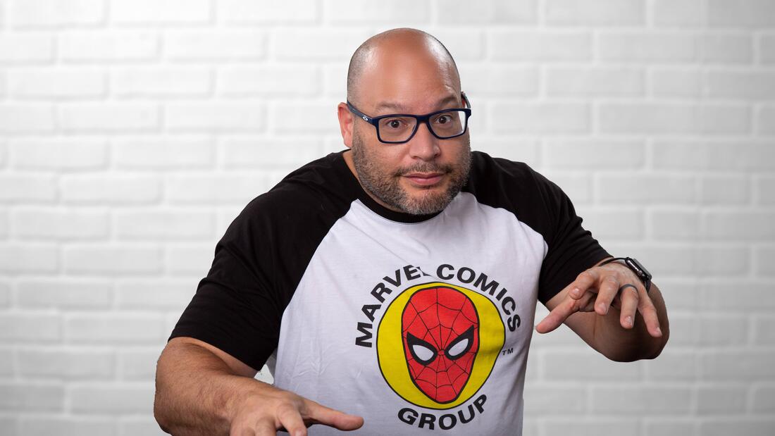
Now, it's time to let your style reflect your gamer spirit. Are you ready to sport your very own piece of the Mushroom Kingdom? Click on "Grab Your Peachy Tee Now!" and let the world know that you're not just any player, you're a Super Mario Bros. connoisseur. Remember, in the words of our favorite plumber, "Let's-a go!" and let's carry the magic of Princess Peach and the Mario Bros. with us, in our games and in our style!  Well, let's zoom in on this question faster than the Millenium Falcon in hyperdrive. Mike's career journey is more diverse and action-packed than a Marvel comic strip. He's been a peacekeeper in the U.S. Marine Corps (think Captain America, but with less spandex), a mentor at Platt College (the Yoda of design, if you will), and a Creative Art Director at Reliance Worldwide Corporation (a role where he wielded creativity like Thor wields his hammer). Currently, as the Creative Director at Enlyte and the genius behind AstroBrand Media, Mike is pulling off a Nick Fury-meets-Tony Stark fusion. He's gathered an extraordinary league of marketers and designers, and together they are making their mark across a range of industries, from retail to solar. But what about his powers, you ask? Mike is a wizard in design, his command of Photoshop, InDesign, and Illustrator would make Doctor Strange envious. But his true 'Infinity Stone'? His mastery in video and animation production that would have Peter Parker racing to catch up. Mike draws his design inspiration from the same source as a Jedi draws power - from everything around him. But two elements stand out – comic books and Star Wars. He harnesses the visual drama of comic books, combining it with the narrative depth of Star Wars, to create designs that are as visually striking as they are engaging. His work doesn't just tell a story, it immerses you in an experience - a journey into a galaxy where creativity and strategy intertwine like the strands of the Force. His leadership? Imagine Captain America's inspiring presence combined with Obi-Wan Kenobi's sage-like wisdom. Mike guides his creative Avengers, tackling deadlines and design challenges with the tenacity of a Mandalorian bounty hunter. But don't just take my word for it. Mike's LinkedIn is a veritable Hall of Justice of glowing recommendations. From Marine comrades to design disciples, all laud his professional prowess, creative genius, and Jedi-like leadership. His work ethic? Solid as Vibranium. His leadership? Comparable to the greatest of the Jedi Order.
So, to answer your question: Why hire Mike Matamala? Because he's the creative, experienced Jedi Master your brand is looking for. He'll take your project to a galaxy far, far away and back again, delivering results that will leave you in awe. So, what are you waiting for? Give Mike a call, and like any good Marvel post-credits scene, prepare to be on the edge of your seat, excited for what he'll conjure up next!
 Hello, design and marketing aficionados! This is your friendly neighborhood creative director, Mike Matamala, coming at you with an exhilarating crossover of comic book lore and professional wisdom. As a lifelong fan of comic book giants like Marvel and DC, I’ve often found a treasure trove of inspiration within their pages that has directly influenced my work. So, fasten your utility belts and prepare for a journey through the comic book universe as we delve into the lessons it holds for marketing and design. The Art of Storytelling in Comics When we think of comic books, often the first things that come to mind are the epic tales spun by the likes of Marvel and DC. These stories have gripped readers for generations, thanks to their immersive storytelling. We've cheered as Spider-Man swung through the skyscrapers of New York, empathized with Batman's crusade against crime in Gotham, and marveled at Wonder Woman's compassionate strength. These stories work because they engage our emotions—they make us care. Similarly, in marketing and design, we aim to create compelling narratives that tug at our audience's heartstrings. It’s not about merely selling a product or a service; it’s about presenting a narrative that inspires, resonates, and motivates action. Marvel, DC, and Visual Storytelling The visual appeal of comic books is undeniably striking. The stylized artwork of Jack Kirby in the Marvel Universe or the gritty realism of Frank Miller's Batman in DC creates immersive worlds that leap off the page. As designers, we can draw inspiration from this. The choice of color, the design elements, the typography—all these can be used to create an emotional connection, to tell a story that aligns with our brand narrative. Character Development and Branding: Lessons from Marvel and DC Marvel and DC have given us some of the most iconic characters in pop culture. Think about the depth of Tony Stark's transformation into Iron Man, or the resilience of Superman as Clark Kent, the alien trying to fit into human society. These characters are more than their superpowers or costumes—they are their values, their struggles, their evolution. Branding, in essence, follows the same principle. It goes beyond a sleek logo or a catchy tagline. A brand needs a persona, a voice. It needs to be more than just a business—it needs to be a character that your audience can relate to and root for. Evolving with the Audience: The Marvel and DC Way Both Marvel and DC have stood the test of time, continually adapting their narratives to reflect societal changes and audience preferences. They have tackled pressing social issues, explored a plethora of genres, and reinvented characters to stay culturally relevant. This ability to evolve is an invaluable lesson for any business. We must be willing to adapt, innovate, and shift our strategies, keeping our brand invigorated and aligned with our audience's changing needs. Multichannel Storytelling in the Comic Universe Our favorite superheroes no longer reside only within the pages of comic books—they've transcended into movies, TV series, video games, and merchandise. This is a testament to the power of multichannel storytelling. As marketers, we should strive to weave our brand narrative across multiple platforms. Every blog post, social media campaign, or website design should add a new layer to our brand story, creating a comprehensive and cohesive narrative. Navigating the realms of marketing and design can often feel like stepping into a superhero's shoes, filled with challenges, victories, and transformations. The colorful and dynamic universe of comic books, particularly the iconic worlds of Marvel and DC, offers invaluable lessons for us. It teaches us the art of compelling storytelling, the power of visual engagement, the necessity of deep and evolving character (or brand) development, and the importance of a consistent narrative across multiple platforms.
As we take inspiration from these graphic narratives, we realize that our 'superpower' in marketing and design lies in our ability to craft a captivating story, create a memorable visual journey, and continuously adapt to resonate with our audience. It encourages us to view our work not just as a business necessity, but as an opportunity to inspire, to ignite imagination, and to make a lasting impact. So, let's channel our inner Stan Lee or Jack Kirby and get ready to create some marketing and design magic. Remember, with great power comes great responsibility. Let's use our powers wisely and continue to create worlds where our brands can truly soar! Until our next adventure, stay creative! |


Greetings Earthlings, we are your creative partners! Our futuristic designs are light years ahead. Join us on a journey to explore new creative possibilities!