|
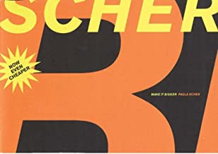
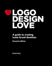
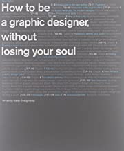
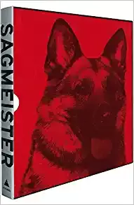
Hello fellow Creative Crusaders! Allow me to lift the cape and shine the Bat Signal on some crucial tomes that have been my trusty sidekicks on this thrilling journey in the design universe. These books have bolstered my design superpowers, serving as my Alfred to my Batman, providing insights, advice, and inspiration in every swoop and swirl of my creative endeavors. First up in our Hall of Justice is "Thinking with Type" by Ellen Lupton. This book is like my Green Lantern’s power ring - a vital tool for harnessing the universe's raw energy - in this case, typography. It’s a deep dive into understanding and appreciating the elemental yet profound role of type in design. Next is "Steal Like an Artist: 10 Things Nobody Told You About Being Creative" by Austin Kleon. This book reminded me of the true power of 'mutation' a la X-Men. It champions the philosophy of adopting, adapting, and evolving ideas into your own unique creative expression. "Logo Design Love: A Guide to Creating Iconic Brand Identities" by David Airey is the Captain America's shield of design books. Airey shares strategies to build iconic brand identities, as resilient and recognizable as Cap’s shield. "How to be a Graphic Designer, Without Losing Your Soul" by Adrian Shaughnessy is like the heartwarming narrative of Spider-Man, reminding us of the mantra, "With great power, comes great responsibility". It guides us on maintaining authenticity in our creative journey. Then we have "The Design of Everyday Things" by Don Norman. This one is the Wonder Woman's Lasso of Truth for designers, illuminating the truth behind intuitive design and user experience. In the lineup, "Make It Bigger" by Paula Scher is the Thor’s Mjolnir, wielding the power of her extensive design experience and wisdom to deliver a thunderbolt of inspiration. "Grid Systems in Graphic Design" by Josef Müller-Brockmann – the Iron Man's suit of the design world, it's all about precision, structure, and technology – the backbone of every solid design layout. And lastly, "Sagmeister: Made You Look" by Stefan Sagmeister. This is like stepping into Doctor Strange's Sanctum Sanctorum, a treasure trove of the mystical and unique, sparking immense creative inspiration. Book Covers and Amazon Links:
Honorable Mention:
As we conclude this thrilling escapade through the maze of inspiration and wisdom, one thing is clear – a Creative Director’s education never truly ends. Much like our cherished superheroes, who continually adapt and evolve, we too, in our design journeys, must keep exploring, learning, and pushing boundaries. We covered typography to branding, creativity to authenticity, user experience to professional wisdom, and structured layouts to unique inspiration. But there’s always more knowledge waiting to be unveiled, more wisdom to absorb.
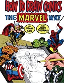
For the sake of honorable mentions and a special nod to our superhero theme, we can't ignore "How to Draw Comics the Marvel Way" by Stan Lee. This classic resource, as timeless as the invincible Wolverine himself, offers valuable insights into the art of creating iconic comic characters. It's the perfect combination of education and entertainment, reminding us that at the heart of our profession lies a simple truth – design is meant to be fun, adventurous, and a little bit extraordinary, much like the superheroes we've been referencing. So, as we hang up our capes and stash away our power rings for the day, let's remember to keep our minds open, our pencils sharp, and our spirits high. Like superheroes saving the world, we have a mission too - to make it more visually appealing and meaningful. And armed with the power of these phenomenal books, there's no challenge we can't conquer. Until the next adventure, fellow creatives!
0 Comments
 As a comic book fan and graphic designer, Stan Lee has been a major inspiration to me both personally and professionally. His imaginative storytelling and character development has impacted the comic book industry in countless ways, and has pushed me to think outside the box in my own creative work. Whenever I'm working on a new comic or design project, I often find myself asking, "What would Stan Lee do?" His bold approach to creativity has encouraged me to take risks and never settle for anything less than the best. In short, Stan Lee's contributions to the world of comics and design will always be a source of inspiration for me.
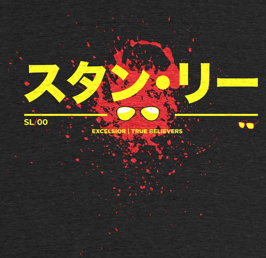
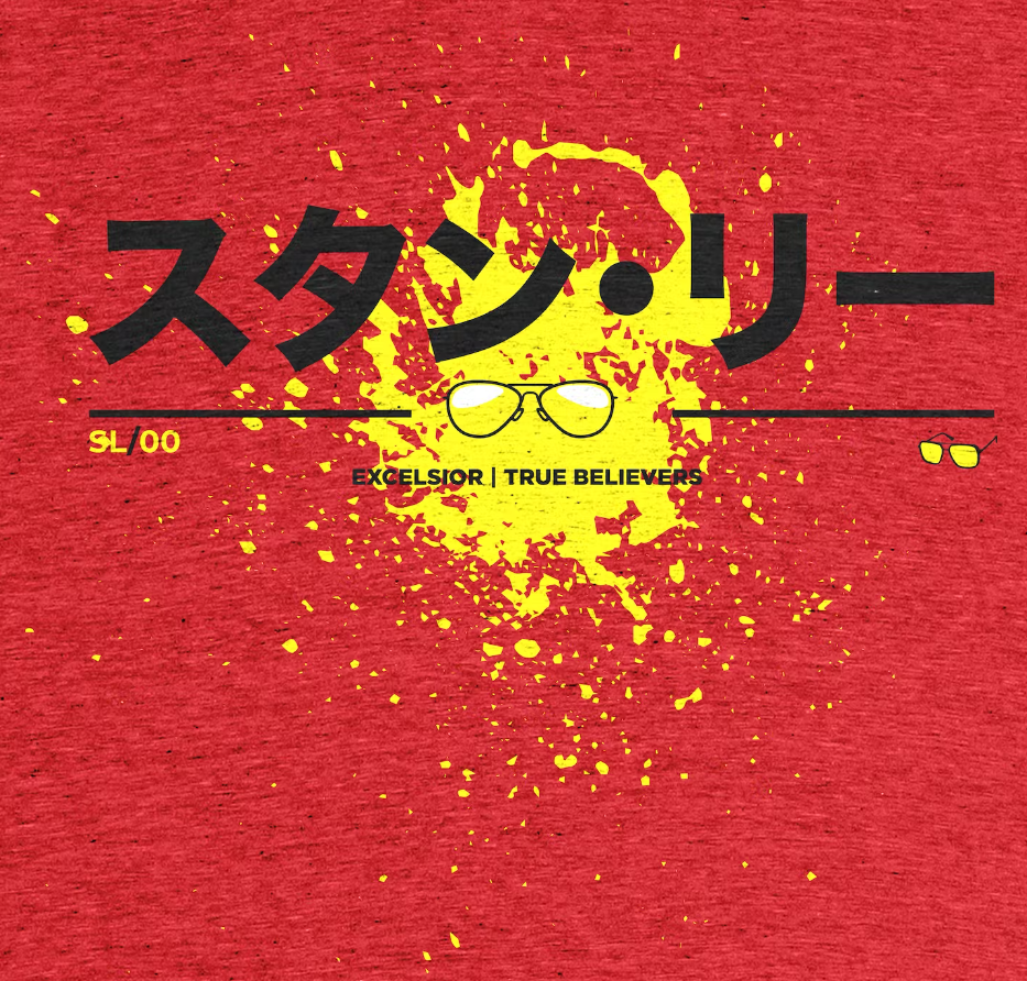
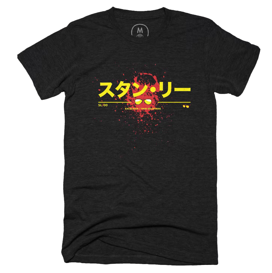
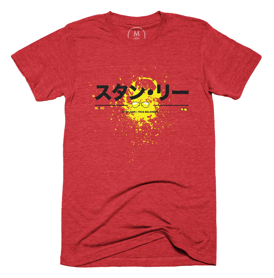
I've always been fascinated by the way Stan Lee approached character development. He had a way of creating characters that were relatable and flawed, yet still heroic and aspirational. His characters were fully realized individuals with unique personalities and backgrounds, and he was able to infuse them with a sense of humor and humanity that made them more than just one-dimensional superheroes. This approach has had a major impact on my own comic book work, as I strive to create characters that are complex, relatable, and engaging to readers. I've learned from Stan Lee that a great character can be the foundation of an amazing story, and that developing those characters takes time, effort, and a willingness to explore different angles and possibilities. In my professional graphic design work, Stan Lee's influence is equally profound. One of the things that stands out to me about Stan Lee's work is his ability to create characters that are instantly recognizable and memorable. Whether it's Spider-Man's red and blue suit, or the Hulk's green skin and ripped purple pants, his characters have an iconic look and feel that has become synonymous with the Marvel brand. This has taught me the importance of creating strong visual branding in my own design work, and has encouraged me to think creatively about how to make my designs stand out and make an impact. We celebrate the birthday of the legendary Stan Lee who would have turned 100 years old on December 28, 2022. Stan Lee wasn't just a writer of superheroes, he was one himself! He gave life to some of the most iconic characters and teams in comic book history like the Fantastic Four, Spider-Man, the Avengers, and the X-Men. He was instrumental in shaping Marvel Comics into what it is today. To honor the legacy of this comic book legend, we've designed a special t-shirt that pays homage to his incredible contributions to the world of superheroes. Wear it proudly and let everyone know that you're a true believer in the power of comic books and the impact that Stan Lee had on the genre. Excelsior!
Typography is all about the way that words look when they are written down. For print, that means thinking about things like the size of the words, the spacing between them, and the style of the letters. We want to make sure that the words are easy to read and look nice on the page. For digital applications, we have to think about how the words look on a screen. We need to make sure that they are big enough to read, and that they are clear and easy to see even on a small screen. Both for print and digital, we need to choose the right kind of letters and fonts to use, so that the words look good and make sense. We want to make sure that the words are easy to understand, and that they match the overall style of the project. So, in short, typography is all about making words look nice and easy to read, whether they are on paper or on a screen. In today's digital age, typography plays a critical role in creating effective communication. The right font, size, and spacing can make all the difference in how your message is received by your audience. From websites and social media to print materials, typography can transform your brand and message and set you apart from your competition. This post explores the power of typography and provides insights on how to use it effectively to communicate your message and achieve your business goals. Whether you're a designer, marketer, or business owner, this post will provide you with valuable tips and strategies to help you make the most of typography in your communication efforts. Below are some common frequently asked Question san basic terms of Typography.  What are the best Typefaces to use for Print & Digital work? There are many typefaces to choose from, and the best ones to use depend on the specific project and its goals. However, I can give you some general guidelines for choosing typefaces for print and digital work: For print work, it's important to choose typefaces that are easy to read and that look good on the page. Serif typefaces (like Times New Roman) are often used in printed materials because they are easy to read in longer passages of text. Sans-serif typefaces (like Arial or Helvetica) can also work well for printed materials, particularly for headings or short sections of text. For digital work, it's important to choose typefaces that are easy to read on a screen. Sans-serif typefaces tend to work well in digital applications because they are easier to read at smaller sizes. Some good choices for digital typefaces include Arial, Verdana, and Open Sans. It's also important to consider the overall style and tone of the project when choosing typefaces. For example, a modern or minimalist project may benefit from a clean, simple sans-serif typeface, while a more traditional project may benefit from a classic serif typeface. Ultimately, the best typeface for a project will depend on a variety of factors, including the audience, the project goals, and the overall design. What about Social Media? When it comes to choosing fonts for social media, there are a few things to keep in mind. First, you want to make sure that the font is legible and easy to read, even on smaller screens. Second, you want to choose a font that fits the overall style and tone of your brand or social media account. Finally, you may want to consider using a font that is widely available across different platforms and devices. Here are some fonts that are popular for social media:
Remember, the best font for your social media posts will depend on your specific needs and goals. Experiment with different fonts and styles to find what works best for your brand or social media account. Anatomy of a Typeface Here are some of the different parts that make up a typeface:
Typography is important for several reasons. First, it ensures that text is easy to read and understand by using appropriate font size, spacing, and alignment. This is especially important for people with visual impairments. Second, typography greatly affects the overall look and feel of a design. It can create a sense of harmony and balance, and help convey the intended mood or tone of the content. Third, typography can be used to communicate information beyond just the words on the page. It can indicate emphasis, create hierarchy, and help guide the reader through the content. Finally, typography plays a key role in branding and can help establish a consistent visual identity. In short, understanding typography is essential for effective and successful visual communication, whether it's for digital or print applications. What are some programs that leverage Typography? There are several programs that are commonly used for typography. Here are a few of the most popular ones:
Ultimately, the best program for typography will depend on your specific needs and preferences. For professional print design, InDesign is often the go-to choice, while Illustrator is great for vector-based typography work. For basic typography needs, Word or Google Docs can suffice. How important is Typography, really? Typography can be used to communicate powerful messages and ideas, and can be a key element in creating effective campaigns for social change. Typography can influence social change in several ways. First, it can be used to create a sense of urgency or importance around a particular issue. The use of bold or large typography, for example, can grab people's attention and make them more likely to pay attention to a message. Typography can also be used to create a sense of unity and community around a particular cause. Consistent use of typography across multiple platforms, such as social media, print media, and websites, can help create a cohesive and recognizable visual identity for a movement or campaign. Typography can also be used to challenge social norms and stereotypes. The choice of typography can subvert expectations and challenge traditional ideas, making people rethink their assumptions and beliefs. Overall, typography can be a powerful tool for social change. By using typography effectively, designers and activists can create messages that inspire action, challenge social norms, and bring attention to important issues. Good typography theory is a set of principles and best practices that help designers create effective and visually appealing typography. It involves key elements such as legibility, hierarchy, contrast, alignment, consistency, and context. Typography that is legible and easy to read is essential, and appropriate font sizes, line spacing, and letter spacing should be selected. Hierarchy is used to guide the reader's eye, while contrast creates visual interest and hierarchy. Alignment creates order and organization, while consistency helps create a cohesive visual identity. Context is also important, and the medium and audience should be considered. By applying these principles, designers can create typography that is both effective and visually appealing, ensuring that their message is communicated clearly and engagingly
|


Greetings Earthlings, we are your creative partners! Our futuristic designs are light years ahead. Join us on a journey to explore new creative possibilities!