|
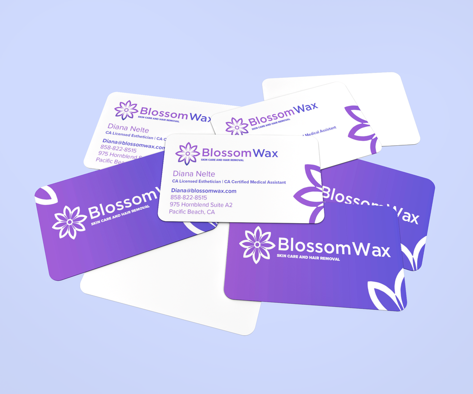
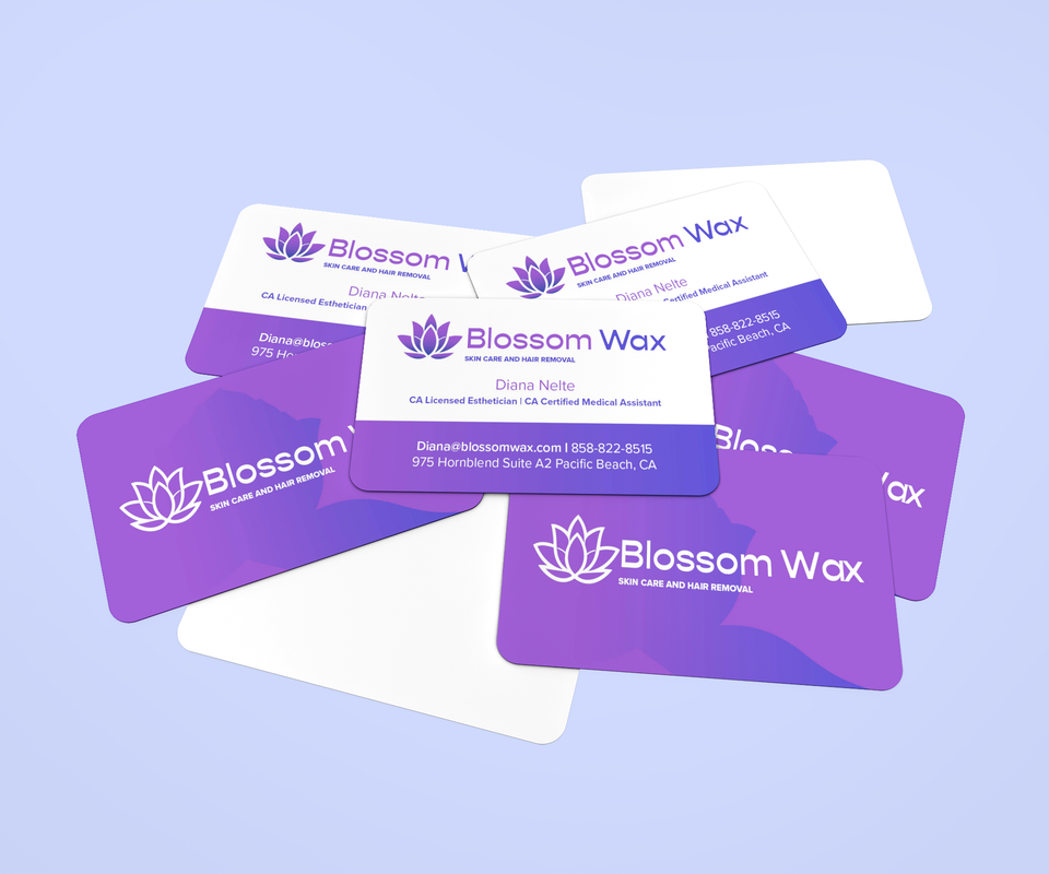
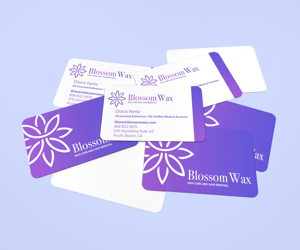
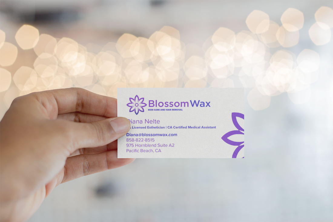
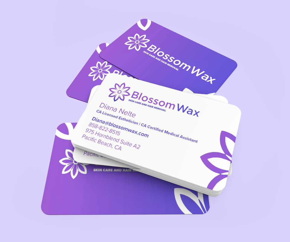
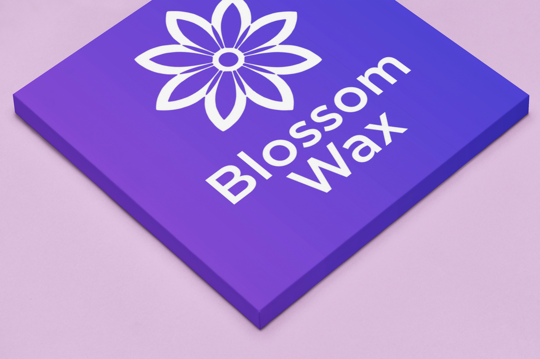
Case Study // Blossom Wax Welcome to the visual journey of BlossomWax, where the essence of beauty and self-care is encapsulated in every curve and hue of our brand identity. As the lead graphic designer behind this vibrant project, I'm thrilled to share the creative process that brought the BlossomWax vision to life
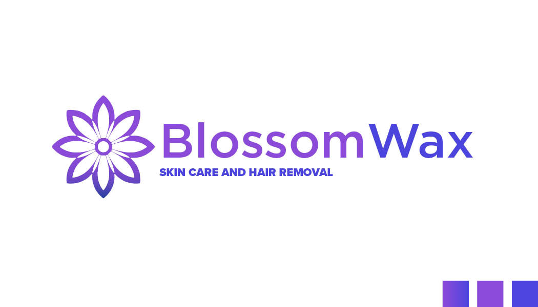
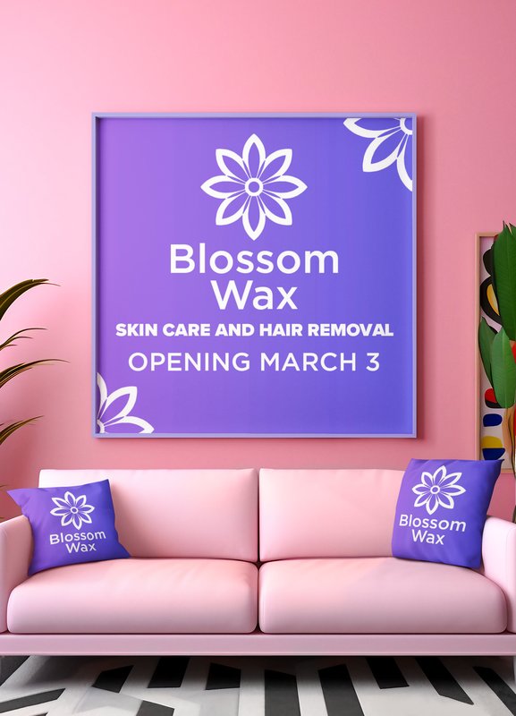
In the realm of skin care and hair removal, where every touch and detail matters, our mission was to craft a logo that not only stands out in a saturated market but also resonates with the delicate nature of our services. The BlossomWax logo is a testament to the harmony between aesthetics and functionality, a visual symphony that speaks to the soul of our brand. Join us as we delve into the intricacies of design thinking, color psychology, and the strategic choices that culminate in the creation of a brand identity that is not just seen but felt. From the initial sketches to the final flourish, every element of the BlossomWax logo is imbued with intention, serving as a beacon of tranquility and beauty in the bustling landscape of daily life. Final Design
Design Break Down
Color Scheme:
0 Comments
 Are you ready to embark on a wild ride through the quirky world of branding, artificial intelligence (AI), and creativity? Buckle up because we're about to take you on a rollercoaster journey at the upcoming event, "Branding in the Age of AI." We'll be virtually gathering to unravel the mysteries of how AI is reshaping the branding landscape. From predictive analytics to personalized experiences, AI is like the fairy godmother of branding, granting wishes and making dreams come true (well, almost). But before we dive into the serious stuff, let's take a moment to appreciate the unexpected wisdom of Jack Reacher. Yes, you heard that right. The man with the plan, the legend himself. In our recent blog post on [Your Company's Blog Name], titled "What Graphic Designers Can Learn from Jack Reacher," we uncovered some surprising parallels between Reacher's no-nonsense approach and the principles of effective graphic design. Who knew a fictional tough guy could teach us so much about branding? Now, let's sprinkle in a bit of humor as we extend our analogy to the realm of branding and AI. Picture this: Jack Reacher strutting through a crowded marketplace, armed with nothing but his wits and a smartphone loaded with AI-powered branding tools. As he navigates through the chaos, he's making split-second decisions, just like brands do when leveraging AI to stay ahead of the competition.
But wait, there's more! The fun doesn't stop there. In another blog post on [Your Company's Blog Name], titled "AI Art: The Intersection of Creativity and Technology," we explored how AI is reshaping the landscape of artistic expression. It's like having a robot Picasso painting masterpieces while you sip your morning coffee. Who knew robots had such a knack for art? And let's not forget about Adobe Photoshop Beta, the superhero of design software. In our blog post titled "Harnessing the Power of AI in Adobe Photoshop Beta: A Marvel for Design Heroes," we uncovered how AI-driven features can turn even the most amateur designer into a design superhero. Move over, Iron Man. There's a new hero in town, and it's AI-powered Photoshop. As we prepare to dive headfirst into these topics at the "Branding in the Age of AI" event, we invite you to join us for a wild ride filled with laughter, insights, and maybe even a few surprises along the way. Don't miss out on the chance to learn, laugh, and connect with industry leaders who are shaping the future of branding in the digital age. So grab your virtual ticket, put on your best poker face (or your best Jack Reacher scowl), and get ready for an adventure like no other. We'll see you there! 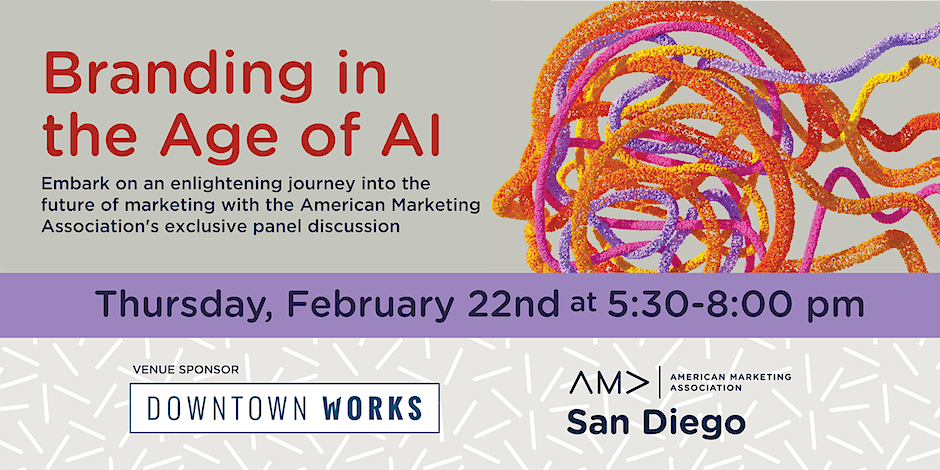  As I've been binge-watching the captivating "Reacher" series on Amazon, I couldn't help but draw parallels between the intriguing world of Jack Reacher and the creative field of graphic design. At first glance, the character from Lee Child's novels might seem like a far cry from the digital canvas of a designer. However, the more I watched, the more I realized that Reacher's unique skill set and approach to problem-solving offer some surprisingly relevant lessons for graphic designers. In this witty and insightful blog, let’s explore how the traits of this beloved fictional detective can inspire and guide graphic designers in their craft. 1. Meticulous Attention to Detail Just like Jack Reacher's eagle-eyed attention to detail helps him crack cases, graphic designers can benefit from a similar focus. It's often the little things – a pixel here, a shade there – that elevate good design to great. Embrace your inner detective and scrutinize every element; your designs will thank you for it. 2. Adaptability and Problem-Solving Reacher's life is a rollercoaster of unexpected turns, much like the design world. He adapts and thrives, showcasing the art of improvisation. As designers, the ability to pivot and solve problems creatively isn’t just a skill – it’s a superpower in the fast-evolving digital landscape. 3. The Art of Minimalism and Simplicity Jack Reacher carries only the essentials, and there's a lesson here about the power of minimalism. In design, less is often more. Stripping your work down to its bare essentials can lead to a more potent and impactful message. 4. Keen Observational Skills Reacher's sharp observational skills are legendary. For graphic designers, a similar attentiveness to emerging trends, client feedback, and subtle design elements can lead to work that's not only visually stunning but also strategically sound. 5. Decisiveness and Confidence Just as Reacher confidently navigates through chaos, a graphic designer must trust their instincts. Decisive and bold choices often lead to groundbreaking designs. Believe in your creative vision! 6. Resourcefulness in Design Resourcefulness is Reacher’s middle name. He uses whatever is at hand to get out of tight spots. Similarly, a resourceful designer can work wonders with limited tools or under tight constraints, turning challenges into opportunities. 7. Persistence and Resilience Reacher’s dogged persistence is a trait every designer should emulate. In an industry where revisions and rejections are part of the process, resilience becomes key to success. 8. Strategic Thinking Planning several steps ahead is standard for Reacher. Apply this to design: think about the long-term impact of your work, anticipate trends, and strategize to ensure that your designs not only look good but also achieve their intended purpose. 9. Empathy and Understanding Your Audience Despite his tough exterior, Reacher often displays a deep understanding of human nature. As a designer, empathy towards your audience is crucial. Understanding their needs and emotions can lead to designs that resonate on a deeper level.  |
Greetings Earthlings, we are your creative partners! Our futuristic designs are light years ahead. Join us on a journey to explore new creative possibilities!