Our Work
ComicCon Concept
Construction Marketing
Education Technology
Entertainment Marketing
Healthcare Branding
Manufacturing Design
Product Launch
Restaurant Branding
Solar Energy Marketing
Stylist Guide
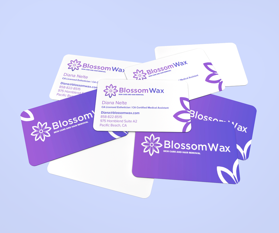
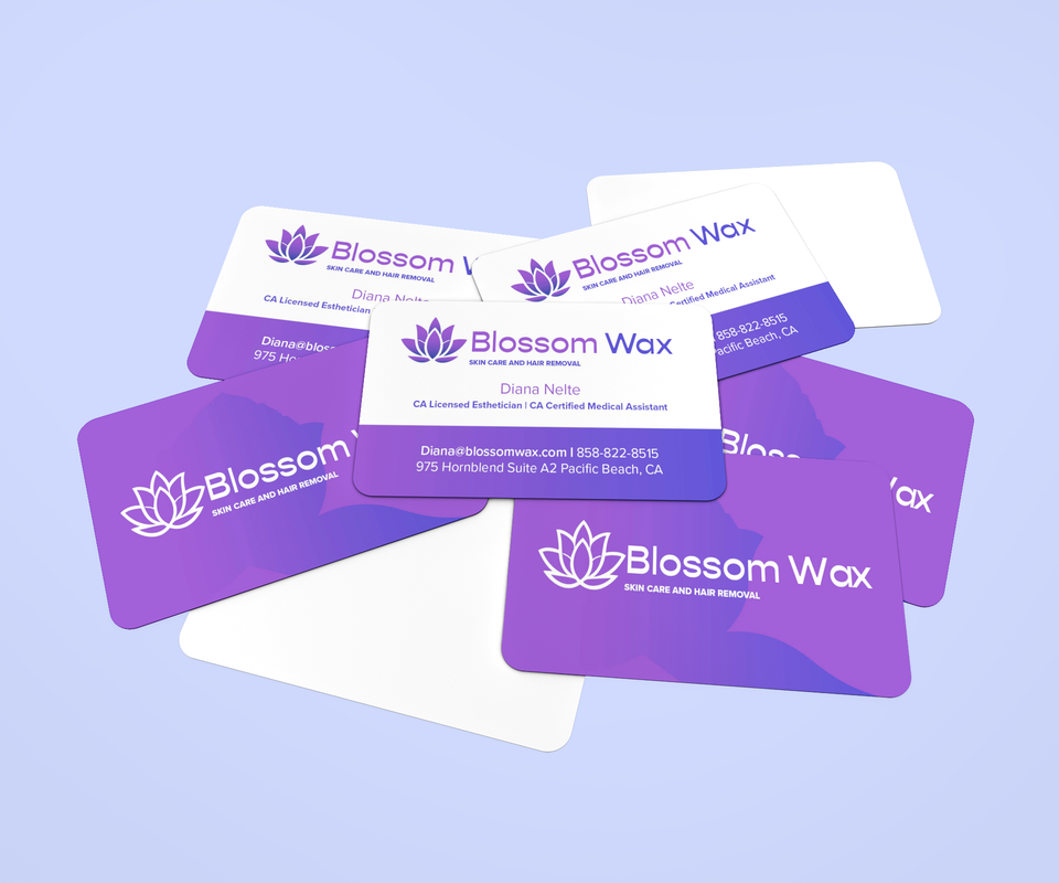
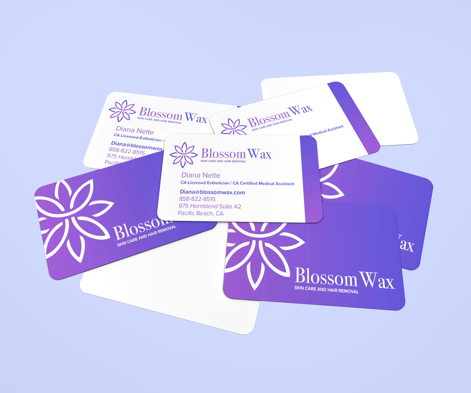
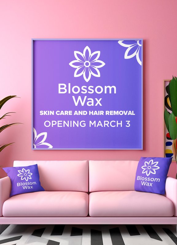
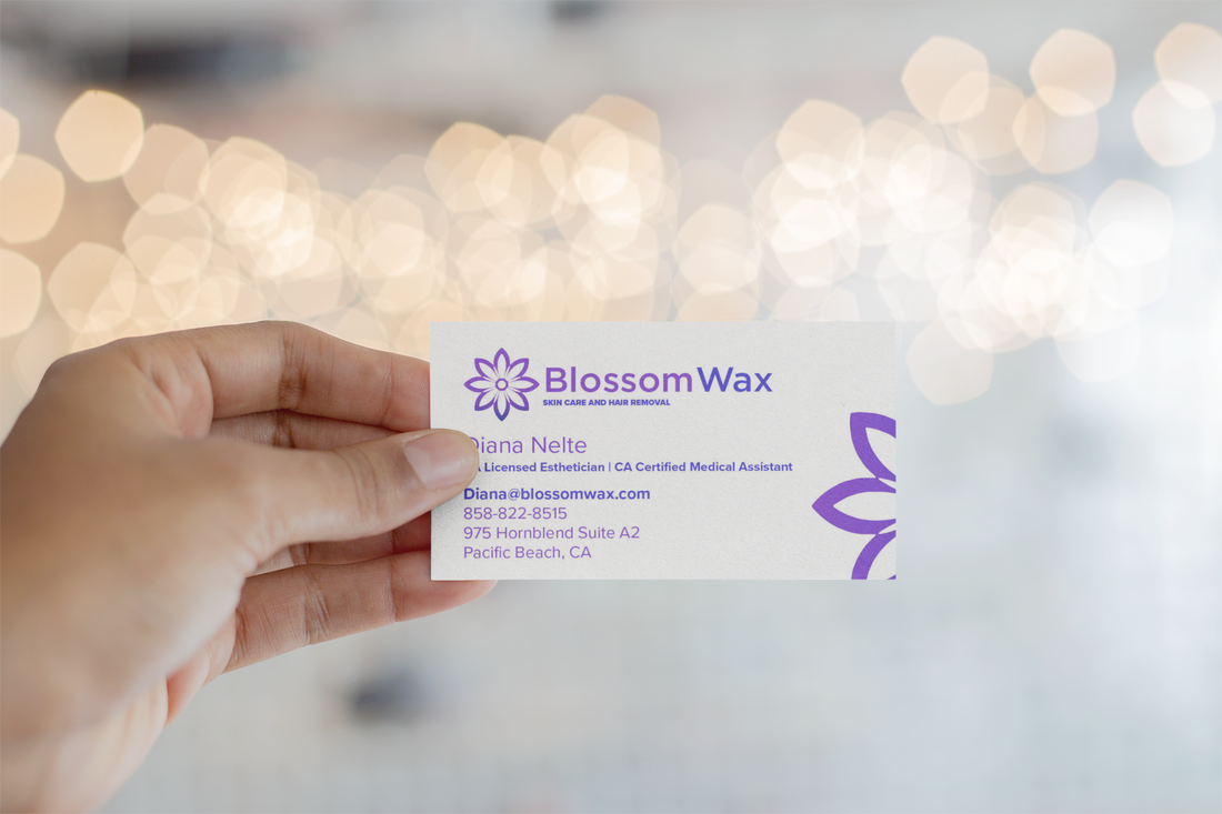
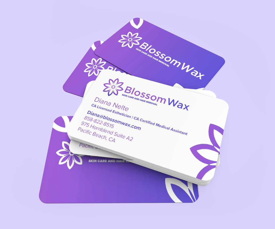
Wellness Branding
Blog
Store
Contact Us
PayPal
Our Work
ComicCon Concept
Construction Marketing
Education Technology
Entertainment Marketing
Healthcare Branding
Manufacturing Design
Product Launch
Restaurant Branding
Solar Energy Marketing
Stylist Guide
Wellness Branding
Blog
Store
Contact Us
PayPal